
Case Study
Credly by Pearson
Brand Strategy • Rebranding • Visual Identity • UX/UI Collaboration • B2B & B2C Branding • Competitive Analysis • Website Redesign • Marketing & Product Alignment • Design Leadership
Background
Credly, a New York-based SAAS company founded in 2012, empowers individuals by connecting their verified skills to professional opportunities. With a mission to help people achieve their full potential based on verified abilities, Credly set out to evolve its brand to better align with its vision.
Challenge
By 2020, Credly was generating millions in revenue, but its brand identity hadn’t kept up with its growth. The original branding was a patchwork of elements from its early startup days, lacking the polish and cohesion needed to compete at a higher level. To establish credibility, differentiate from competitors, and reinforce its position as the leader in digital credentialing, Credly needed a full rebrand.
The goal? A bold, human-centered identity that reflected its mission: celebrating achievements and helping individuals unlock their full potential.
Objective
Rebrand Credly in 3–6 months while maintaining brand recognition and ensuring a seamless transition across all touchpoints. As the sole designer, I led the full visual transformation, collaborating closely with the CEO, CXO, and Senior VP of Marketing to ensure alignment.
This meant:
Connecting with both B2C and B2B audiences without alienating either.
Creating a brand that exudes credibility and trust to support business growth.
Building a seamless, UX-friendly experience across marketing, web, and product.
This was more than a logo refresh—it was a complete overhaul of the visual identity, website, marketing materials, and product UX/UI. While I was the only designer, I worked cross-functionally with leadership and the product team to bring the brand to life across all customer touchpoints.

Approach
I partnered closely with Credly's leadership team to set strategic milestones. The project began with an in-depth competitive analysis to uncover opportunities for differentiation. Key insights from the analysis helped shape the direction:
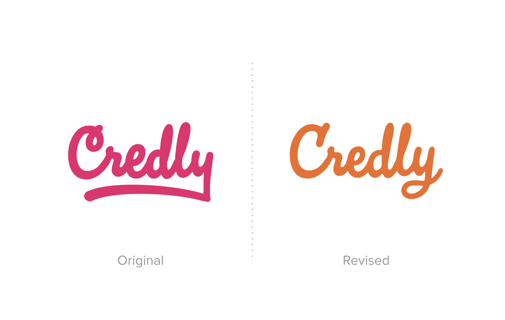
Maintaining Brand Equity: Credly's distinctive, bold color palette (previously centered around pink) was integral to its brand identity. The decision was made to retain the core color scheme while modernizing it for a fresher feel that would still stand out in the industry.
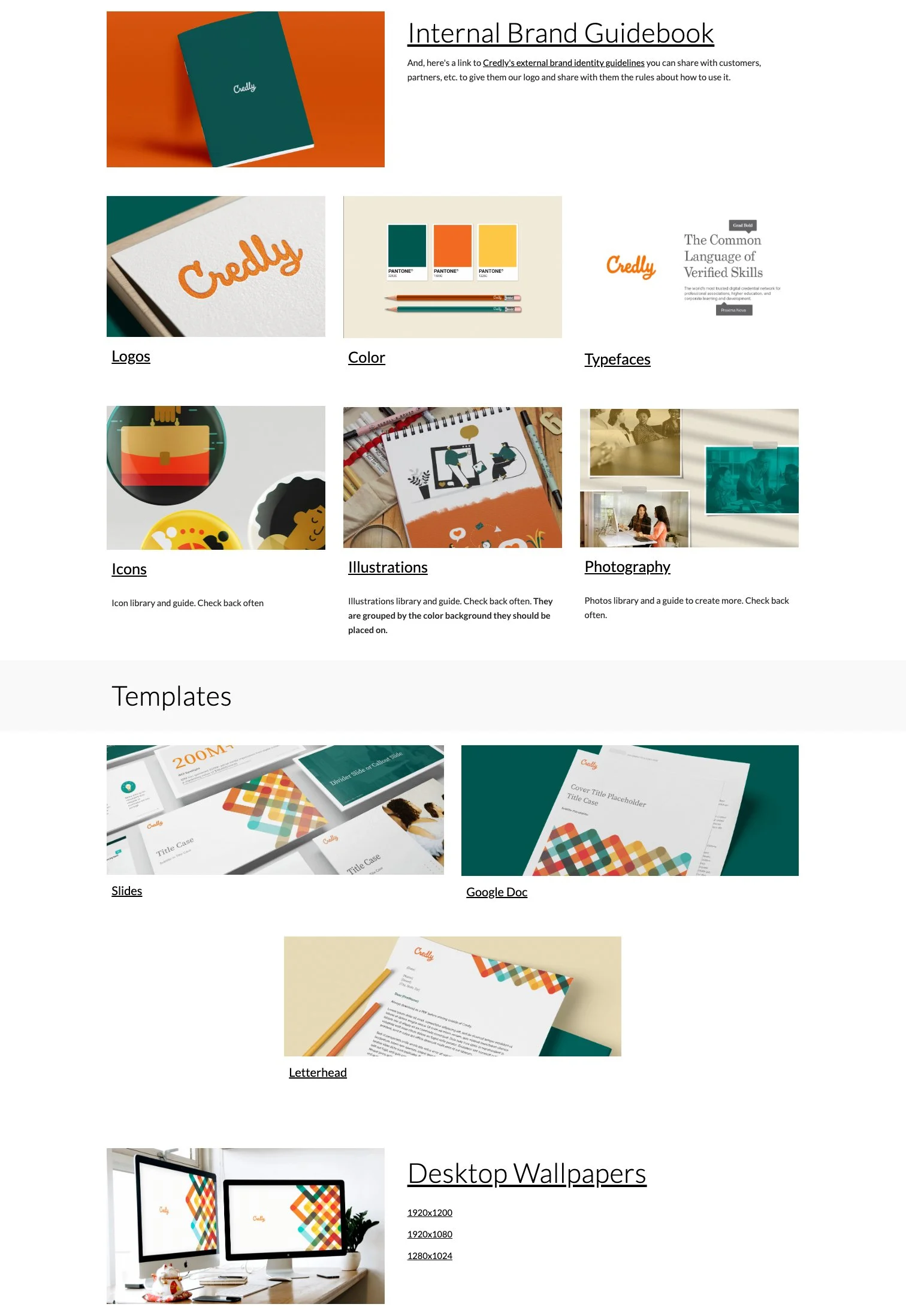
Logo Refinement: The existing Credly wordmark had strong brand equity, so my recommendation was to refresh the logo rather than redesign it entirely. The goal was to retain familiarity while enhancing its impact. It also was so drastically different than it’s competitors and that was something to preserve. The leader in the space and the rebel.
Balancing B2C & B2B Needs: The platform served two distinct audiences: credential earners (B2C) and companies (B2B). The challenge was to create a brand that would resonate with both, particularly ensuring the B2B side was professional and trustworthy, as this was where the revenue resided.
The rebranding process focused on several key initiatives:
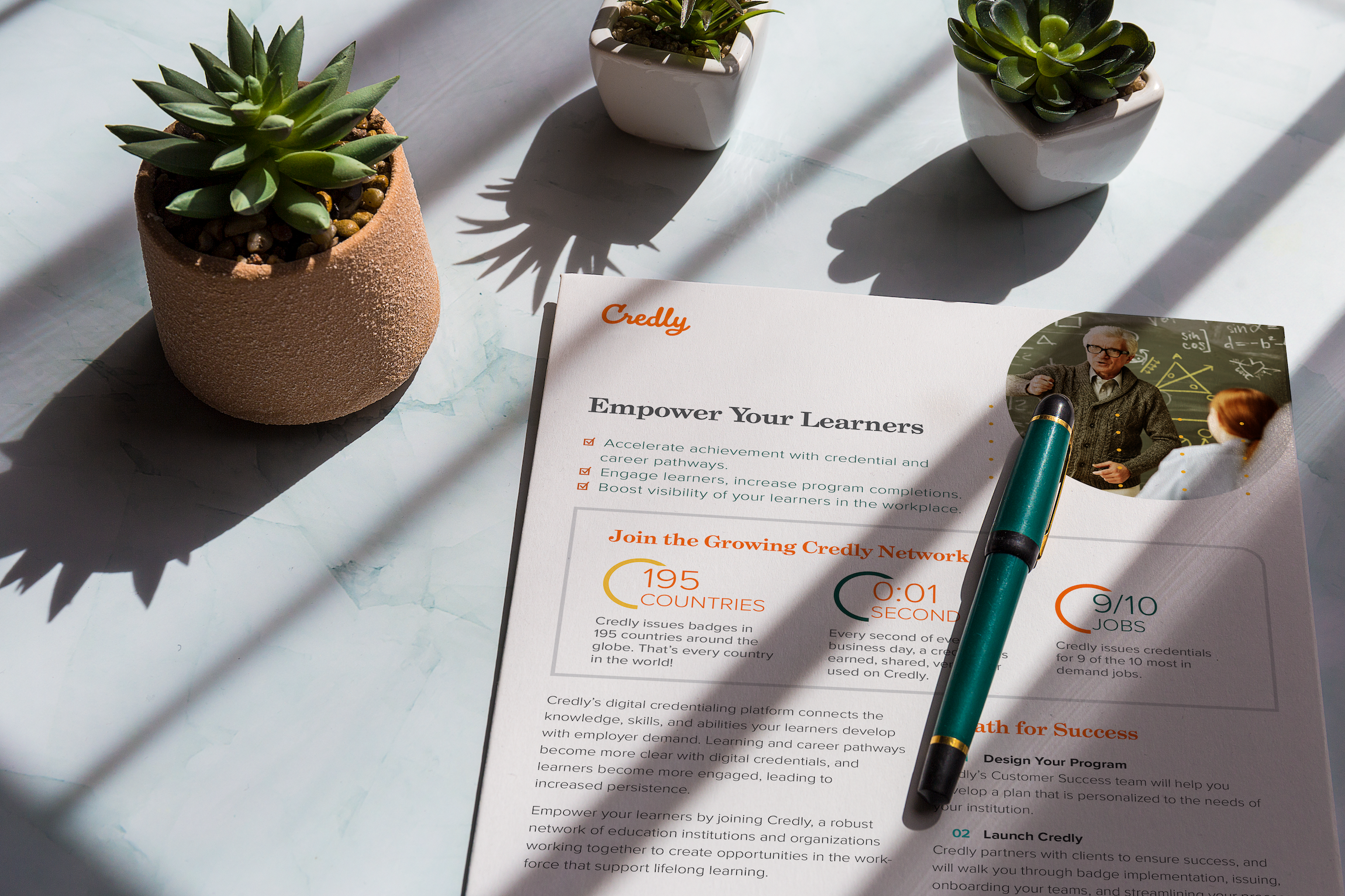
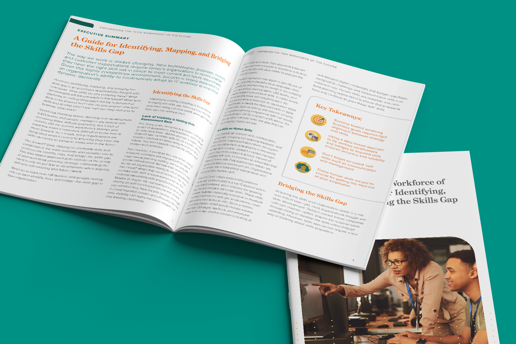
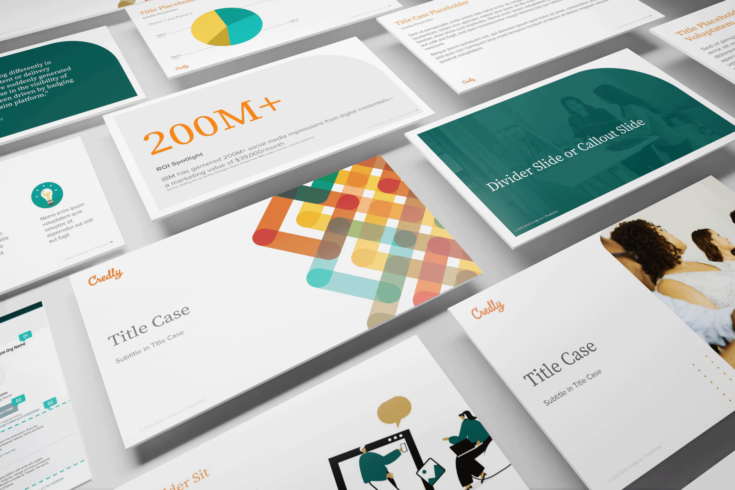
Visual Identity Overhaul: We focused on refining the bold visuals, choosing Grad, a serif typeface, for headlines. This was selected for its balance between tradition and modernity, evoking the feeling of certificates and established credibility.
Modernizing the Color Palette: The signature bold pink remained but was adjusted for a more contemporary, inviting look.
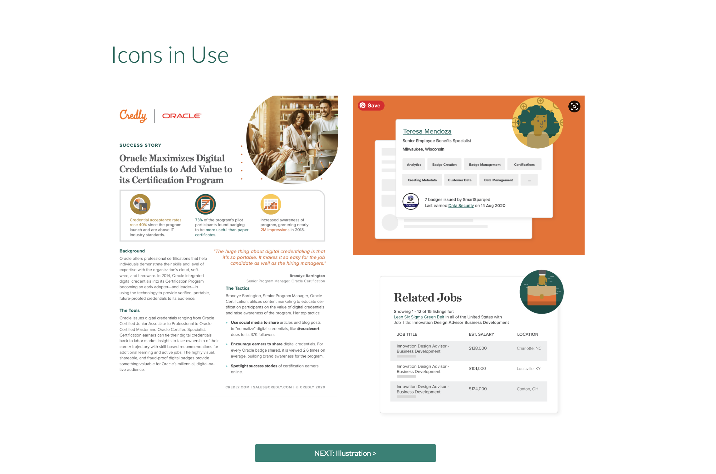
Pattern Design: A custom pattern symbolized the interconnectedness and trust Credly has within its global credentialing network.
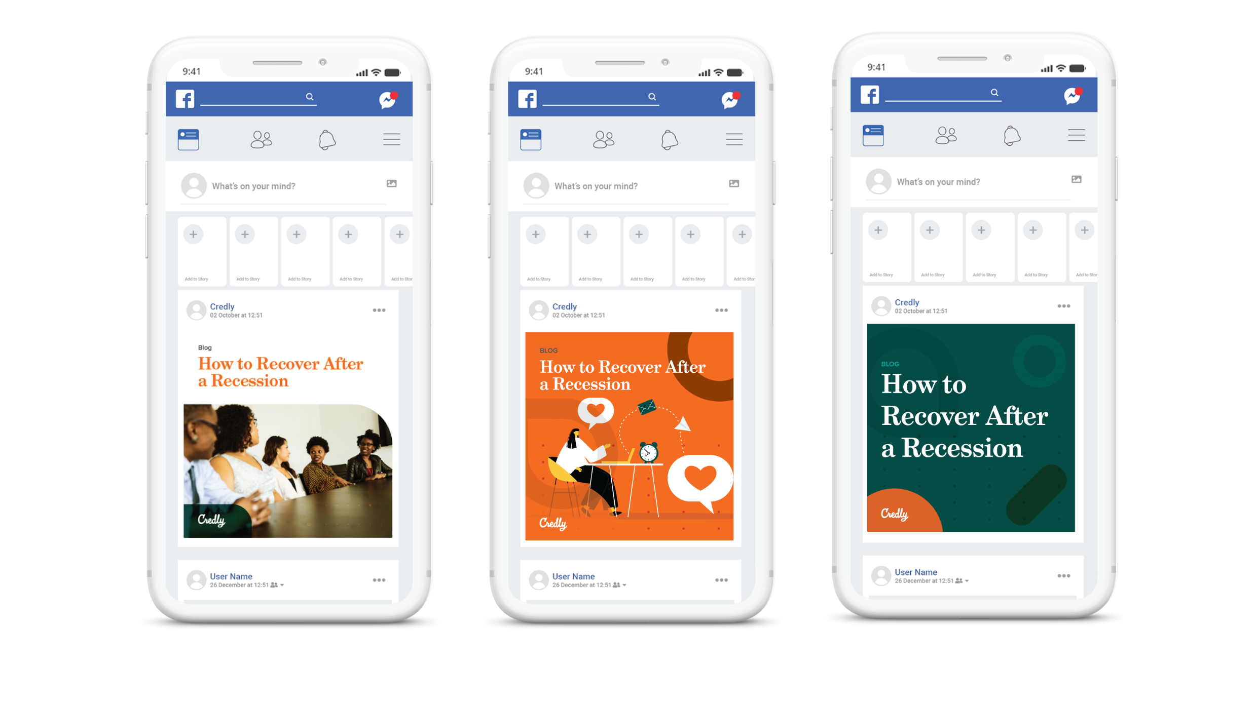
Photography & Icons: The imagery was human-centric with warm, inviting tones, while custom icons mirrored the look of the credentials on the platform, reinforcing Credly’s identity.
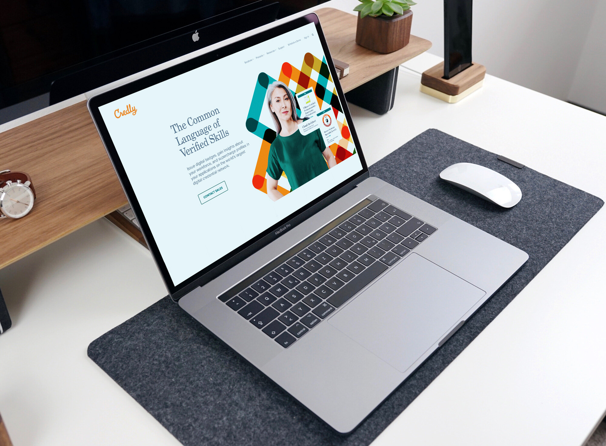
The rebranding was executed across all touchpoints, including the website, marketing collateral, and product design, ensuring a seamless experience that connected the brand story with the platform's functionality.
Results
The refreshed visual identity was successfully launched, with the following outcomes:
Brand Recognition: The new brand positioning solidified Credly's reputation as a bold and innovative leader in the credentialing space.
Increased Revenue: In 2022, Credly's revenue reached $10.7M up from $4.9M in 2021, a direct result of the refreshed brand’s impact on both B2B and B2C engagement.
Stronger Market Position: The rebrand also positioned Credly to better integrate with Pearson, which acquired the company in 2022. This acquisition further validated the success of the rebrand as it aligned with Pearson’s focus on workforce learning and reskilling, with a market opportunity now valued at approximately $400 billion.
Conclusion
The Credly rebrand has proven to be a game-changer, both visually and strategically. The combination of a refined identity, a more professional yet approachable look, and a cohesive brand story has allowed Credly to connect with a wider audience and achieve remarkable business growth. Credly’s continued success and integration with Pearson will be bolstered by the strong foundation laid through this rebranding effort.
Great brands aren’t just designed…
They’re built with strategy, collaboration, and a deep understanding of their audience. Let’s create something memorable together.